Tuesday, December 11, 2012

Low Slung Texas-style TOD overtaking Charlotte's South End

Image by Sean Busher © Neighboring Concepts
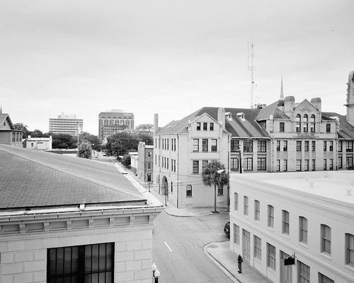
A LYNX Light Rail stop in Charlotte's South End


The cover story on last Sunday's edition of the Charlotte Observer profiled the apartment development boom continuing in Charlotte's South End. The interesting point it raises is the relationship between land prices and density. The higher the land value, the higher the density developers have to pack into apartment projects, so market cycles are basically reflected in the density realized by Transit Oriented Development projects.  At least in Charlotte. The Observer's Kerry Singe recounts amusingly how Proffitt Dixon Partners, the developer of the Fountains at New Bern (overlooking the New Bern LYNX station), took advantage of the market swing:


"The firm bought the land at a discount from the lender, cut the number of units and added a lounge where tenants can wait for the train."

Read more here: http://www.charlotteobserver.com/2012/12/07/3711178/light-rail-attracting-apartment.html#storylink=cpy

Singe quotes firm partner Wyatt Dixon: “We bought the property at an attractive price; we had a great design for the site, and we weren’t forced to pay so much for land where we had to over-densify.” Of course, the article makes a reference to the premium added to apartment rents by the "convenience" represented in the light rail. Numbers of similar reports on the South End tend to credit the light rail for the entire effort, but it is worthy to recount some of the development history in the corridor to follow up on this topic with a bit more nuance.

In the early 90's this district which had previously borne no name was rebranded the South End, an old textile mill and warehousing district just a ten minute walk from Charlotte’s bank town skyscrapers. (Leticia Huerta's cotton bulb mosaics in the base of the transit shelter columns on the image above commemorate that past.) Light rail service was still two years away, but when I first arrived in Charlotte in 2005 to begin working for an architecture firm involved in the South Corridor project, the newly minted TOD zoning district category was shortly to be recommended for much of the South End.  (Though I myself arrived too late to have a part in it, my firm co-designed the LYNX stations with Sasaki.) A year before I arrived, the Charlotte Trolley restoration effort had reintroduced rail transit to Charlotte by linking the South End to Uptown using an abandoned rail line the City had purchased for the planned light rail.

In anticipation of the light rail, this trolley-served strolling district was in 2005 in the midst of a condominium building boom representing almost half a billion dollars of private investment. That it was primed to do so already says nothing exceptional about the South End. Like many previously neglected old mill districts in central areas of cities, the South End became a hot market for new and adaptive reuse development when design firms began moving in and converting the mill buildings to good uses.

Moreover, the district occupied the transitioning edge between two distinct prewar neighborhoods, Dilworth and Wilmore.  The former had revitalized in the 80’s and was among Center City Charlotte’s most affluent neighborhoods. The latter, Wilmore, was challenged with high poverty rates and, arguably, was just beginning the gentrification process. The South End was thus at that seam of change in cities that prove enormously attractive to developers, not only because of the favorable economic factors driving regeneration, but because much of the property available is in large lots that are easy to purchase and assemble due to accrued obsolescence, property underutilization or vacancies.

But according to Mary Newsom, "South End's development was sparked...by a small-time, volunteer trolley run. So it was the hope of light rail, and a modest little rail ride, rather than mass transit service itself, that was key" (to South End's TOD building boom).


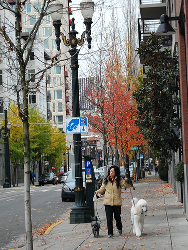
Another new Texan-style TOD apartment complex in South End
For many urbanists, mass transit is merely useful as a symbol. But the action of developers, apparently, bear Mary Newsom out. Consider the story of the Fountains at New Bern mentioned in the Observer article.

The sales information cheat sheet on the City's property records website indicates that the prime corner piece of the property for the Fountains at New Bern had changed hands numerous times between speculators, beginning with the first $2.6 million purchase of the property from a land holding company in October 2006, well over a year before the LYNX inaugural run.  Just a short while later, in the height of the South End's condo building bubble and still a few months away from light rail service, the property commanded a $9.25 million purchase price on August 7, 2007. LYNX service began in November of 2007, but shortly thereafter the bubble burst. The property was therefore dumped for $5 million in April of 2009 just as the LYNX was hitting its peak ridership numbers, which were hovering back then over 19,000 daily boardings (they have since slumped down to 15,000 apparently).  In June of 2011, Wyatt Dixon's LLC bought the land for a cool $1.567 million, which is a whole mil less than the initial price spurred by TOD speculation in 2006! 

Other properties with new development on them indicate a similar pattern of property exchanges.  So, the early hopes for light rail brought rampant speculation for TOD development that neither the symbol nor the reality of transit was able to deliver to Charlotte. The actual rail service itself has little to do with any of this. It is the public will for higher density development that indeed drives the market, and that has a lot to do with other forces intrinsic to market dynamics and the politics of the area itself.

I would thus insert to Mary Newsom's take home lesson this: the City’s participation in the effort is something that did matter greatly. The light rail transit vision compelled the City to purchase the right-of-way, and it was that vision that fanned the flames in plans, in zoning, in capital improvements and in policy changes. These things don't control the outcomes but they really matter. By merely becoming associated with the symbol of transit, the tracks that had recently symbolically divided the well-off neighborhoods on the east side from the somewhat struggling ones on the west side were now speeding the governmental choices promoting the development activity between them.

The Observer article makes the pertinent observation that the South End caters to the young professionals that are somewhat averse to long commutes and mortgage traps and that makes it therefore ideal for higher density apartment development. Judging by the gated, Texan-style apartment products being built, it is these car-based yuppies, more than the light rail service itself, that are the compelling force behind "Transit Oriented Development" in Charlotte.


Seeking more than crap? New commercial development spurred by the South End apartment boom.
Trendy apartments, indeed, are great magnets to attract the Creative Class set and the associated development that population helps spur. I do think the hipsters and the faithful taco trucks that the South End attracts are a huge benefit for the corridor. For one, large numbers of young, affluent people are likely to sustain new commercial activity along South Boulevard (think: light rail bar crawls, Saturday markets and pet breed clubs). Hopefully this brings much better quality, public realm enriching, mixed-use new development to what our former mayor Pat McCrory (now governor-elect) called a "corridor of crap". To that end, I look hopefully to the creativity in the halls of Government Center.

Sunday, September 30, 2012

The "Grain" of a City Grid and What That Means for Mobility

Drayton
Not long ago, reflections on Savannah's Historic District prompted a study to examine the street roles of Savannah’s Historic District grid. The broad aim of my attempt to classify her street types is to produce a kind of working classification system of urban streets that I call an“odonomy”, a taxonomy of grid streets giving names to distinctions that tend to remain unobserved due to present ways of thinking of streets. Just providing names can provide a starting point for further reflection regarding their interdependent roles. This is needed because when it comes to grids, urban designers tend to focus only on quality of connectivity and intersection density, but then allow traffic engineers to dictate the section of the streets, who I believe apply the inappropriate functional classification system of branching networks to grid streets.  A devastating lack of awareness thus exists in how you lay out or modify streets to actually create a traffic behavior supportive of fine-grained urbanism and multimodal balance. With a working and deepened odonomy, in contrast, a project team can employ network-defined categorical distinctions for street types from day one of design work and remain highly conscious of network roles and the subtle advantages their functional strengths can provide for development. Trade-offs can be described and opportunities be made visible. For the context of what follows, I recommend reading posts tagged in The Odonomy of Savannah Series. I especially recommend these two short posts on The Invisible Signs of Savannah (on Intersections) and The Avenue in order to get a flavor of what this study is about. 

An Odonomy of Savannah Recap: The "Grain" of a Grid and What That Means for Mobility

Savannah’s historic grid affords clarity for the challenge of creating an alternative to the “functional classification” for the street types of grids, since it is almost unique to grids in the fact that it consistently differentiates many types of grid streets. The functional diversity of Savannah street types guides the evolution of Savannah’s urbanism in a way that can be easily read and brings their virtues to the surface. Thus far, I’ve uncovered two sets of obvious contrastive relations distinguishing Savannah streets from one another. Before I advance my odonomy of Savannah, a little review is in order. In this post, I shall review and build upon the first distinction I observed.

The distinction immediately evident in Savannah’s street grid is the distinction between the streets traveling along the predominant “loading grain” of the grid and the streets traveling perpendicularly to that grain. Below is a conceptual representation of the predominant grid condition we find in North American cities:

The “loading grain” is the orientation of the grid along which most of the “street address” streets are traveling, the street orientation that is favored for frontage.  Previously, I called the grain traveling streets collectively “Loading Streets” and the cross-grain traveling streets simply “Avenues”. I have decided that the far more descriptive and accessible terminology will be to refer to the former collectively as “Grain Streets” and to the latter as “Ray Streets" or the "cross-grain" streets.


The contrastive term I've chosen for "grain" is "ray", a reference to the medullary rays in wood.  These are ribbons or sheets of cells that radiate outward from the heart of a tree trunk.  If you look at the end-grain section of a cut of wood, these rays are the slight striations crossing the growth rings perpendicularly.  (I thought also of using the term "Check Streets", in reference to the "checks" or radial splits that you often see develop in wood stumps, but I think this term would be far less accessible and lead to unhelpful associations.) I think "ray" is appropriate metaphorically also because I like the fact that medullary rays help with structural support and help protect the inside of the trunk by conveying resins to check and destroy pathogens.  However, I mostly like the term "ray" because, in the general meaning of the term, it suggests directness. By using these botanical referents, moreover, notice that I am conveniently avoiding the use of terminology that leads to thinking of grids in purely orthogonal terms.  A grid system can be thought more carefully as a polar system dependent upon the curvature of grain streets. Frederick Law Olmsted and John Nolen employed curvilinear street networks this way to create adaptive grid-like street patterns that curve with topography (the results are there for you to enjoy in the streets of Nolen's Myers Park Neighborhood in Charlotte).  Therefore, we can talk about curving "grain" and converging "ray" orientations for curvilinear fabrics as well.

The "curvilinear grid"of John Nolen's Myers Park - a curvilinear variant of the Simple A-B Grid type.

The Grain Streets are the streets that prominently serve and access uses by providing the primary frontage for the majority of the parcels. The Ray Streets, on the other hand, primarily serve the grid by facilitating travel mobility in the grid. While Ray Streets take up real estate (the main reason these streets are largely absent in the street networks of postwar suburban subdivisions), having lots of these in your grid has a tendency to amplify transportation mobility, since, besides multiplying travel options, they typically remove or soften the conditions that lead to queuing and friction impeding vehicular movement. When employed well for their natural virtues, they not only distribute traffic efficiently throughout the grid, they actually help it move faster for all modes.

Those ray street virtues are amplified even more in Savannah by treating the avenue traffic as one-way flow on north-south couplets bounding the cellular wards.  Indeed, observing Savannah’s one-way, two-lane avenues in action affords the easy realization that these streets do not have to be wide to move large volumes of traffic rapidly. Clocking my travel times in my vehicle during peak times, I noticed it took on average close to half as long to travel in the north-south cross-grain direction of the Savannah grid as it did to travel the same distance in the east-west direction on grain streets such as Liberty Street and Bay Street (except on those few occasions when I was lucky to catch all the green lights on Bay Street).

Remarkably, those ray streets in Savannah also do not pose much of any barrier for either pedestrians or vehicles crossing them since one-way traffic “platoons” enough to offer sustained breaks for crossings. Drayton Street, pictured in Flickr user adamtrevillian’s photo above, as well as in my “Proper Scale” banner at the very top, is one such street. Notice how quiet and easy to cross it looks - that is often the predominant experience of the street to pedestrians encountering it, believe it or not. The traffic appears to be "missing" much of the time. Indeed, the photo above exudes the lonesome quality of Charles Sheeler's or Edward Hopper's precisionist works. You wouldn't know that this is one of Savannah's most heavily traveled streets. (But notice, in the distance, the traffic platooning behavior in action in the far right of my banner image.)

While much of Savannah's avenue efficiency is gained by treating the internal avenues as one-way couplets (such as the Whitaker Street and Drayton Street pair), in fact, the "ray street" function in itself has a role in keeping traffic moving along speedily. The predominant distinction of ray streets in the A-B Simple Grid is that they have many more intersections on average for the same length than grain streets. Queuing is minimized in Savannah's ray streets not only by removing opposing traffic for left turning, it is also the result of the fact that these streets cross a tremendous amount of intersections, allowing traffic to enter and turn off at more points than just at major intersections, hence allowing vehicles more options or more direct routes to their destinations. In other words, queuing through traffic needs to wait less on the Ray Streets than it would otherwise need to do at major intersections. Astoundingly, the abundance of minor intersections is not a great hindrance for avenue traffic because crossing grain street traffic must yield to these streets everywhere except at the crossings with major grain streets, which only occur every 1/8th mile or greater.  From Liberty Street to Gaston Street, avenue traffic doesn't have to stop on Drayton at all, a distance of almost a third of a mile! (A remarkable feat for a grid with a 600+ intersection per square mile density.)

Strangely, this first-order differentiation just described between "Grain Streets" and "Ray Streets", as obvious as it might be, hardly seems to penetrate the consciousness of planners and road designers. I suspect this is the fault of thinking within the framework of the normative arterial-collector-local (branch-network) classificiation system.Yet this is the most important distinction between Savannah’s street types. These two characters also comprise the two predominant street types of most grids since almost all grids exhibit loading grains subarea to subarea. In truth, the distinction between grain streets and ray streets is not as important for the common "gridiron" Simple A-A square grids, especially the large block gridirons such as the one found in Uptown Charlotte, where the loading grain tends to change so often it could be irrelevant. But it is important for the common U.S. Land Ordinance or streetcar grids, which typically contain blocks twice as long in the loading grain direction as they are wide (660’ x 330’- a furlong by half a furlong). Savannah’s grid makes such an importance patently obvious. Try as hard as it may, Drayton Street can never become a Broughton Street, and there are several very good reasons for this that have little to do with travel lanes, sidewalks, building relationships and width. The functional strengths of each street are simply different for reasons of grid geometry.

The functional classification systems used or being modified by engineers and planners today are terribly misguided for many reasons when applied to urban conditions, but one big deficit they all seem to share is that they tellingly ignore the Ray Street as a distinct urban type that needs special attention. I’ve argued that the humble, no-frills, frontage avoiding, utilitarian avenue, in fact, is the most urban of streets. Without it, you tend to create grids that behaviorally imitate the branching street networks of the suburbs by attempting to maximize the loading condition (Jarrett Walker introduced an apt term for these tree-like suburban networks: “dendritic” street patterns). Urbanists seem not to be aware that the default street setting that they depict in their street sections actually imposes dendritic behavior into grid networks. Sometimes New Urbanist leaning planning departments codify frontage relationship by law regardless of street function.  Such form codes will invariably encourage the creation of grids exhibiting dendritic behavior by stiffening access management, creating street sections that are friction prone (slowing transit), funneling traffic flows in grids and thus creating heavier queuing conditions at intersections (making pedestrian/cycling crossings problematic), and eroding mobility overall by cavalierly removing vehicular through connections. Even New Urbanists who are aware of network advantages keep themselves boxed in the same paradigm as their engineer brethren by distinguishing urban arterial streets primarily by width. Really? How helpful can that classification strategy be when what a street needs in terms of multi-modal capacity is primarily dependent on the transportation network and the area context? In my opinion, their latest papa-bear, mama-bear, baby-bear urban arterial classification system applies, properly speaking, only to the default setting of suburban street networks.

Monday, May 28, 2012

Sketching the Duke Energy Center

The Duke Energy Center, a few weeks ago after a shower (taken from the rooftop of my office building).
The recent CNU ballyhoo over the attack of the "vertical cul-de-sacs", has got me thinking about my love affair with tall buildings. My most recent crush is Charlotte's most recent addition to the skyline, the Duke Energy Center (DEC). Locals call it the "Voltron Building" because its outlines can glow every color on the spectrum throughout the evening (anticipate that it will be given frequent media play during the upcoming DNC Convention).  These colors can represent causes, home games for our local teams, community events, and so on. On special occasions, the building grants variable light shows.  Voltron even has its own twitter handle, @WellsLightsCLT, which daily tweets the color topic of the night.  An email address exists where one can send requests for an evening's color treatment in order to represent  your local cause or event.

You can sort of think of DEC as a civic "weather-vane".  Though I hardly ever go watch the woeful Bobcats play in the Arena, I do kind of like the fact that I know a home game is in progress by spotting the tell-tale blue and orange pride colors on the skyline.  Not only is DEC an indefatigable civic booster, it's Charlotte's chirpiest (and brightest) fan. 

But the thing is...I already loved DEC even when it was just a pile of green slab and cement core methodically inching up the skyline.  Luck had it that at the time I was subletting in a townhome in the South End that had a direct view to the construction site.  Every pleasant evening I would go out to my balcony to take account of the progress.  Eventually, when I had an hour to spare, I started sketching the progress of the skyline, attempting to sharpen my skyscraper drawing skills. Because I'm one of those sketchers without the patience to draw straight lines, this took an act of excruciating mental concentration and page-orienting calisthenics.  But I stiffed it out for the sake of the record. My first result:


The DEC is on the very left.  Unfortunately, I didn't date the above sketch, but I estimate it was executed sometime in the Spring of '08, based on the adjacent material in my sketchbook.  The next sketch, however, is from the 9th of September of '08. Notice that as the DEC got taller, the other buildings seem to have self-consciously grown as well:


...I love the aloof attitudes of the resting cranes...their enormous beak-like arms slung out there hundreds of feet in the air so casually.  They survey Charlotte with an air of unimpressed self-possession, like cowbirds perched on water buffalo.

 The next sketch, executed not long after, took full appraisal of a new situation.  This time, it was the appearance of the next row of townhomes in my development, which would partially block my view to the DEC construction permanently (you can sort of see it partially behind the townhouse).


Since the DEC's construction completion, strangely enough, I haven't felt the lighthearted need to go out and sketch the results, although I've taken many photos of it, like the one at the top.  Perhaps I'm such an architect type that I find the act construction itself the main event.

I think the reason for my fascination with buildings undergoing construction is simply that I'm cognizant of the fact that I'm a kind of construction archivist, recording a passing event that will forever remain unrepeated. For some reason, that needs to be rescued in documentary amber.  Notice that my archivist's compulsion went to the extent of recording the state of the sheathing and curling house wrap on the sprightly townhome... I can't keep myself from doing that.  I want to state: This is where the construction stood at this time. This is when this building was green. It existed this way. You may not believe it, but the cranes used to hover over it like fussy attendants, coaxing it along impatiently.  "There is so much to do here," they said.  "So much to go over while we peck and preen"...

I'm reminded of a Louis Kahn quote: 

"A building being built is not yet in servitude. It is so anxious to be that no grass can grow under its feet, so high is the spirit of wanting to be. When it is in service and finished, the building wants to say, 'look, I want to tell you about the way I was made.' Nobody listens. Everybody is busy going from room to room"...


But enough of that. More than anything, I'm just fascinated by my changing city. I know that I'm seeing first-hand a small speck of what Spiro Kostof called the generative order of the "urban process", which tends to transcend the city's formal origins in such ways that even the careful historian cannot help but to marvel at these sometimes.  This is why I remain unimpressed by spontaneously generative ("emergent") theories of urban design when wedded to formal theories of order.  Such theories must thoroughly supplant the super-ego of the designer with a cosmology. Which is what Christopher Alexander's system is: a cosmology.  It is hard to say whether this is an improvement, however elegant a fractal appears. His is a hybrid of the "cosmic model" of urban design being brought to the normative organic model.  But the only truly "emergent" (spontaneously organic) model of city form may actually be the speculative grid, if anything.

Regardless, Spiro Kostof's gentle reminder is always my forceful recourse of reflection: "...a city, however perfect its initial shape, is never complete, never at rest".  That is good news. Representing that in sketch form, perhaps, is my delight in drawing.


Tuesday, March 27, 2012

Density in Los Angeles: a Matter of Tolerance?

Why LA can build densely. Source: Google Streetview
In the previous post, I claimed that building coverage for residential development, based on North American block usage norms, likes to stay under 70% building coverage since building layouts need to grant adequate daylight exposure to dwelling units. As I began to think more about this, I realized that there are notable exceptions, local norms were high building coverage is possible and even tolerated. Some of these exceptional places are the compact subdivisions of Western/Southwestern U.S. and great swaths of urban Los Angeles.  I have actually never heard others remark on the unique qualities that make LA well-suited for high building coverage, but its set of complimentary conditions - including climate, building typologies, cultural history and block morphology - should be appreciated more about LA.  The remarkable fact that a bountiful portion of LA's blocks incorporate relatively high building coverages with multifamily development may be one of the primary reasons why the city has such a high overall population density (average people per square mile) in comparison with other cities. (By the way, over at Discovering Urbanism, Daniel Nairn has just posted a really handy synopsis of the city density trends revealed by the 2010 Census.)

One way to achieve high coverage density is through block morphology.  You can conceivably create a block pattern that accommodates 100% building coverage for multifamily lots. 100% lot coverage is actually possible on the right kind of block: a very, very narrow block of 130-feet wide at the most (measured street centerline to street/alley centerline) so that you can daylight the units on both sides of a building without providing any private open space at all. You just use the rights-of-way to daylight units. (Such a block structure would actually allow Ed Glaeser to claim we can build 150 1600 sq. ft. dwelling units per net acre without having to go higher than six stories.)  But in the prewar urban fabrics, block widths rarely consistently go under 330 feet in most cities.  Of all the North American city grids that I know, only historic Savannah has a block width as narrow as 130 feet as a normative feature of its grid (these are the "Trust Lot" blocks that face the east and west sides of each historic district square). But a 200-foot wide block, as in Manhattan and Portland, does allow these cities to get high coverages, because relatively little open space can be provided in the interior of the blocks when you have 100-foot parcel depths.

A subdivision in Las Vegas, Nevada, demonstrating the 100-foot deep lot morphology that is pervasive there. (Source: Google Maps
In the West and Southwest, subdivision blocks are also commonly this narrow, allowing for some of the highest building coverages you can find in single-family neighborhoods.  These lots grant homeowners some of the tiniest backyards in America.  In time, as in Savannah (whose town lots are also this deep), these 100-foot deep parcels can conceivably redevelop into denser Savannah-style townhouses, apartments, offices and mixed use buildings. One might argue that it may take longer than the history of Savannah to achieve Savannah's urbanism in these subdivisions, perhaps, since their patterns are conceived mainly to keep strangers out, but the hope to realize a modicum of urbanism is there theoretically.  In these cases, one may achieve Jane Jacobs's lower threshold for urban vitality (in the ballpark of 100 dwelling units per net acre) without, perhaps, needing to build above 6 stories. The narrow lot just makes the overall utilization of land more efficient. That assumes however that you transition from single-family development to attached brownstone-style walk-ups or mid-rise development created by assembling rows of single-family lots.  We'll call this strategy for intensification of land usage the "Savannah Strategy": the strategy of assembling and building higher on shallow single-family lots. The morphology of the block pattern is important to this strategy: how narrow the blocks are and how well the streets can be connected in time.

A block interior in Boston's Back Bay. (Source: Google Streetview)
But placing homes tightly together without actually going all the way and attaching them grants an important advantage with respect to average density.  Actually two important advantages (the second of which we will get to later).  We mentioned already exactly what it is: granting access to daylight.  If buildings have to share walls, then they only have the street-facing side and the back-side for daylight access.  That means the building will rarely get deeper than 70 feet.  Boston's Back Bay is an excellent illustration of this fact. See how much open space in the interior of the block can't be used for building coverage...
A typical block in the Back Bay with building perimeters highlighted for clarity. (Source: Google Maps)
However, note also that for Boston's climate this is very good. You do appreciate the adequate daylight that falls into the space, and notice the pleasant balance between shadow and sunlight at midday in the Streetview image above. Note that the open space to building height ratio is 1:1, around what New Urbanists recommend for alleys and pedestrian rights-of-way. At the ends of the blocks, taller buildings at the corners of the block seal up the sides of the block, creating an intimate semi-private environment in the block interior. You can maybe claim that the Back Bay has the perfect block typology for Boston's climate and the building coverage seems appropriate.  

Now compare the Back Bay with this plan view of multifamily buildings in LA...


Both maps are at the same scale.  If Jane Jacobs observed that building coverage over 70% is "intolerable" in Boston's North End, LA doesn't seem to care. As with the shade-loving Western subdivision, this is where LA's sunshine-soaked climate grants LA one dramatic advantage. In LA, people like shady courts. Snug closeness between neighboring buildings (instead of party walls) is tolerated because direct sunlight is just not as coveted and the fact that there is just an accrued cultural tolerance for detached nearness. This means the buildings can be very deep indeed from front to back. The entire building perimeter serves that all-important function of daylighting units and, therefore, you can go deep into the block with many units at level, with units between the front side and back side units.

In sum, high density in LA is achieved with lot coverage, not building height. To make the comparison visually clear, here's a block to block comparison between the Back Bay and Central LA blocks at the same scale...


A typical block in the Back Bay with building perimeters highlighted for clarity. (Source: Google Maps)

A typical block in Central LA. Note the abundant perimeter available for daylighting units. (Source: Google Maps).
The interesting thing about LA is that LA's building typologies, a product of its cultural legacy, free it from the need to achieve high lot coverages with the "Savannah Strategy", i.e. using lots and lots of right-of-way land to daylight units.  In fact, in LA, the fatter the block the better. Part of the reason the courtyard apartment typology suits it so well is that the half-blocks are just deep enough (in LA, the 330-foot wide streetcar suburb block pattern predominates). This is remarkable for one simple reason: it cuts down on the amount of right-of-way land needed overall.  LA needs fewer streets! And so, it bumps up average density thus across the city. Of course, from the standpoint of Jane Jacobs, this quality of LA poses liabilities.  But it does suggest interesting ways to begin to work in LA (and other sun-blessed cities in California and the Southwest) to achieve urbanist goals with qualities other cities simply don't possess in great abundance.  We can intensify land uses by encouraging more mixture of primary uses in the multifamily fabric, allowing some parcels to go high, and connecting the city better with high frequency transit and bike and pedestrian supporting urban design to lessen dependence on automobile storage. We'll call this the "LA Tolerance Strategy": a strategy where block morphology is just not as important as a cultural tolerance for alternative means.

Sunday, March 11, 2012

Squeezing Jane Jacobs into Mid-rise Urbanism


Hull Street, Boston, originally uploaded by Flickr user Asten.

It seems whenever urbanists discuss development and density issues, I often encounter an assumption that travels widely among urbanists: that the urbanism of Jane Jacobs looks no higher than the mid-rise building environment seen in the photo above. No doubt that the urban village Jane Jacobs loved in The Death and Life of Great American Cities is that mid-rise level urbanism of Greenwich Village and Boston's North End (photographed above). Clearly, Jacobs takes in the book what seems to be a kind of pragmatic, middle-ground position on the topic of residential concentration for urban vitality. If density is too low, she argued, it would fail to foster supportive diversity for primary uses, but if it went too high, it would risk imposing standardization of development with building mono-typologies and thus lose the housing variety needed to support a diverse enough population.

The problem here is the numbers.  Jacobs provided a very rough (and qualified) lower and upper limits for "optimal density" in the "Need for Concentration" chapter (Ch. 11), giving the range as 100 to 200 dwelling units per net residential acre. Urbanists, I'm afraid, widely assume the North End is the upper range for this kind of optimized typology and peg her as a mid-rise urbanist from thereon out, never bothering to take a careful look at the numbers provided. Death and Life here is taken wholesale as a paean for 4-6 story urbanity - that "just right" Mama Bear density that neither creates shadowy downtown canyons, nor 2-level rowhouse sprawl. Frankly, I suspect many urbanists interpret Jane Jacobs's requirement that "most blocks be short", her second condition for generating diversity for urbanity, as meaning staying short height-wise (she meant length-wise).

In this 4-6 story vision of neo-Jacobsian urbanism, we urbanists are quite comfortable operating, I must say. Our personal experience of Greenwich Village and the North End bears it out. We jibe with that kind of close-fitting, yet not too high, urbanity. If buildings got any higher, our snug alleys and pocket parks become subsumed in ominous Gotham city shadows.

But as a land planner, this chapter always startles me when I see the numbers.  In no way do I associate, as Ed Glaeser does, 6 stories with 150 dwelling units per net residential acre! This is at least 8 stories, and that's if parking areas/structures were not to count as part of the residential acreage.  With parking,150 dwelling units per net residential acre (150 DUA for short) looks like a district with a healthy mixture of development that includes many 10+ story high rises. Think Portland's Pearl District.

Pearl District, Portland, Oregon
Why 150 DUA needs buildings taller than 6 stories is a matter of how buildings use blocks.  Most importantly, residential units just do not like to get any deeper than 35 feet from the nearest window.   This fact alone means that your footprint can't match the lot perimeter.  When your blocks are 330 to 400-foot wide (as they are for the vast majority of pre-war urban districts in North America), mid-rise multifamily lots are pretty much stuck below 70% building coverage, not just for architectural taste, but for human needs. (In Portland, the smaller blocks help bump up coverage efficiencies. ...As Jacobs said, frequent streets are good!)

Yes, architects can cut into the open space with projecting wings (like those skinny Brooklyn flats with the plans that look like the white piano keys), but, what that means - and why we are loathe to do so beyond 70% coverage - is that your lower units start losing access to sunlight at 4+ story heights. Even Jacobs notes the disadvantage of coverage that is too high in Chapter 11, discussing the North End in particular. The block on the left side of the North End photo at the top, for example, had 72% building coverage in 1960 - way too high for comfort for her (actually, she called it "intolerable"). That is why it was 123 DUA in that 4-7 story height range.

For most 1-5 acre lots, 60% lot coverage for 6+ story multifamily development is a sober number not to surpass for your development. If you want to hit 150 DUA with this, you will need to go to at least 8 stories to secure adequately sized multi-bedroom units.  That's what 150 DUA looks like at a bare minimum with underground parking.  If we elect to squeeze 150 DUA into 6 stories instead, we are going to be building too many one bedroom units - exactly what we shouldn't be building, according to Jacobs, if we want to promote diversity! To use her terms, that would "standardize" your development to stamp out diversity.

In other words, the six stories Ed Glaeser allotted to Jacobsian urbanism is actually exactly what will undermine it by squeezing it from the other side: it will either not create enough density or not enough diverse housing with density. He would be making his point much more pungently if he enlisted Jane Jacobs as an ally in his argument for going taller. 

More than likely, you are going to be using a lot of high-rises to get anywhere near 150 DUA district-wide.  Especially if you are going to be building a diversity of housing products.

Part of adding diversity is building affordably, and for that you also need construction efficiencies that make it worthwhile for developers. Because the price of steel is so high compared to wood-frame construction (which can't get higher than 6 stories), developers don't like to use it in that vaunted luxury mid-range of 7-12 stories, unless they are building in a market that actually can support that product. I would argue that, in fact, we have to climb higher, up to 170 DUA at least, in order to get enough supportable high-rises that can add affordable family unit products to a district. We need to escape the middle!

Moreover, this makes good sense for architectural reasons. The mixed-use buildings in the 4-6 level range are needed to provide "relief" for daylighting their taller brethren. That mixed typology in a district to me seems what we should be extolling as "neo-Jacobian urbanists" (the Vancouver strategy). By easing regulatory pressures to going higher, urbanist development is able to become more affordable again to the middle class, and I can only see Jacobs applauding Glaeser here. Where she would disagree is that we can settle on one solution to suit every frame; in fact, the mixtures and exceptions are important. Sometimes, regulation promotes. As an architect who has to think about things like daylight and the needs of humans and sheer construction realities, i.e. "regulations" of a sort, I have to add that the physical mixture of diverse architectural products, short and tall, side by side, can secure multiple benefits.

In short, don't trust Ed Glaeser when he talks about architecture. As Adam Christian states, "Glaeser conceives of cities first and foremost as consisting of people and connections, and secondarily of places and buildings." Indeed. (Only the cool imagination deduces six-story walk-ups for one hundred fifty 1600 sq.ft. apartments in an acre!) But, urbanists, we gotta take Ed's advice just the same, for his and Jane's reasons, ...and go high. Very high.