
 |
| Geos Neighborhood Plan by David Kahn Studio |
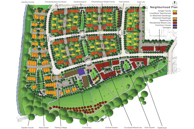
A former colleague of mine sent me a link to the above little gem of a plan. Sometimes I come across a layout so elegant, it requires me to pause and admire the thought that went into it. Like DPZ's minimalist Habersham, SC (which I need to get around to comment more about on this blog), the Geos mixed-use neighborhood plan, by David Kahn Studio, is one such of these.
I can barely make out the lettering in the labels of the plan above, so the exact details are lost on me, but this plan view is enough to get the insights. Most architects will immediately appreciate the fact that the east-west building orientation scheme is well suited for passive solar gain and energy efficiency. Sustainable site planning along this line of thought is not new, of course, but it is rarely allowed to become an overriding concern because of site context and other development goals. What is nice here is not only that the planners insisted on it, they employed the scheme to allow and generate an easy diversity of housing and site responses.
Designers are often hesitant to employ pattern "systems" because we are suspicious of any straight-jackets, but, in fact, here is a good case that proves that playful deployment of patterns often leads instead to creative ideas and a surprising variety of options. Geos's solar orientation scheme reminds me of Savannah's E-W block orientation system a little, but it is more elastic. One can imagine, for example, the central blocks above being elongated in the north-south direction in adapted versions of this layout scheme. (As I've explained before on this blog, Savannah's ward pattern is a rather dimensionally bound and rigid system - which is neither a deficit nor a plus in my mind because enough exceptions to the "rules" are employed liberally in Savannah as well, leading to an interesting diversity of block conditions.)
What is perhaps not so obvious above is that, like typical cul-de-sac subdivisions, the arrangement is also minimizing the amount of asphalt on the ground as much as possible. Notice that all the parking driveways and alleys are double-loaded. The double-loaded, stubbed parking lots are actually the most efficient parking lots you can devise. In a sustainable development, you want to look for these parking "feathers" to inform you that the planner actually has experience thinking about efficiencies for sustainable development. What these lots are doing is eliminating the need for extraneous surface paving for vehicular circulation. They are the absolute minimum condition for parking lot circulation surface. The minimum condition has only one entrance in and out, with as little bending of the aisle as possible and stubbed coldly at the other end. In principle, this is the same asphalt-minimization strategy being employed in a cul-de-sac subdivision. What cul-de-sac developers know about cul-de-sacs is that they are needed to saturate the site with as much single family lots as possible while also minimizing the amount of road surface being spent per lot. In Geos, the asphalt is being minimized for another advantage: to actually create a more dense (low-rise, predominantly single-family) development. It actually "saturates" the site with shared open space and building footprint with as little asphalt surface to serve it as possible. (I try to employ these single-access parking "feathers" as much as possible when developers give me a chance. Here is one example of a "fantasy plan" of mine, where I put parking underneath buildings or in walled-off courts with as little driveway access as necessary).
The infrastructure trade-off here, of course, is that non-vehicular paths are employed very liberally in Geos. But this is what you want in sustainability! You want to discourage vehicular circulation and encourage the pedestrian and bike kind. It is the right trade-off: to replace vehicular infrastructure with the non-vehicular and green kind.
Ideally, these "feather" lots should not be too long in order to discourage speeding and sloppy maneuvering. Yes, stubbed parking driveways are very unaccommodating to drivers. Drivers hate them because they force them, especially if they discover too late that the end spaces are full, to employ multiple-point turning to maneuver in and out of them (especially if they are devilishly narrow). But that's what you want. You want to put the driver at an inconvenience. No one says that sustainable development has to care about such driverly concerns. You want drivers to instead covet vespas!
In fact, one quibble I have above is that the parking aisles on the north-east block above are too long, meaning they will encourage drivers to pick up higher speeds - an accommodation to the driver and something that creates less safety for pedestrians and pets. Ideally, one should cut them off at one end so that every served parking space has only one access point to the street network. I would advice the same for the alleys, if they were not needed for garbage truck access (in these cases, by the way, perhaps the wily planner can entertain inserting a gate on one end - or in the middle of a long two access driveway - that only the garbage truck company can activate).
But what I love most about this plan is the checkerboard deployment of the single family residences in the middle of the center blocks (these are the bright yellow units). You can squint and see that buyers can have a choice of owning a front yard or a back yard. I'm not sure how they will actually fly in the subdivision market of today, but I like this scheme for several reasons:
The obvious reason is that it creates for every unit abundant access to daylight, which is needed in places like Colorado where you have long and bitter cold seasons. But it also creates well-daylit and airy streets, which creates a neighborhood advantage over the densely packed houses of subdivisions going up today, where as little as ten feet clearance can exist between houses. That condition makes streets surprisingly desolate looking with all that driveway abundance and a straight wall of houses packed like sardines - so close you can feel the actual resentment building up between neighbors. If you do have any windows on the side walls, the lack of privacy between you and your neighbor makes you feel like you are living in a peeping tom heaven.
Another advantage that exists with the checkerboard scheme is the one Kevin Lynch notes in Good City Form. It is a form with "reversibility" that thus gives the neighborhood an inbuilt resilience for future fit. Once homes have fallen into deterioration or have become socially obsolete (we don't know what the preferred forms or technologies for homes of the future will be), an owner might elect to develop a second up-to-date house in the present yard space. Once this is built, she can demolish the old house to create a new yard in place of it (or renovate the old home for the grandparents). What you get here is a cyclical strategy for long-term development. The sustainability of resilience. The fact that houses are either set back or at the front of the lot means that both conditions are perfectly allowed! Both are seen as equally valid and socially accepted alternates. Stability here arises from the multiplication of valid options.
